Mapping museum visitor demographics: an interactive survey at Karen Blixen Museum
Written by Rodah Kalondu Lange, Curator and Conservator, Karen Blixen Museum, National Museums of Kenya (Kenya, ITP 2023)
Museums worldwide receive diverse visitors daily, weekly, monthly, and yearly. Various methods are used to gather visitor statistics such as country of origin, age group, whether they visit in groups, families, as tourists, or individually. These statistics are crucial for museum planning, marketing and improving visitor experience. In some cases, these statistics are published yearly. However, most visitors rarely access this information, leading to frequent inquiries from visitors about the museum’s clientele. Common inquiries include: Who are the majority visitors? Where do they come from? What age group dominates? Do school groups visit?
The Karen Blixen Museum, a branch of the National Museums of Kenya, is more popular internationally than locally and often receives such questions regularly. Guides and customer care staff often estimate visitor demographics, sometimes leading to inconsistencies when repeat visitors compare past and current information.
After attending the British Museum International Training Programme in 2023 and learning about visitor surveys, I identified the need for a more engaging and transparent visitor survey approach at my museum. An approach that will involve both staff and visitors in data collection for uniformity. I developed an interactive tool, a world map and displayed it in a strategic location within the museum for visitors to engage in the survey process and learn about their fellow visitors’ demographics. Guides and customer care staffs were requested to assist willing visitors in pinning their location and sharing their experience about the interactive map. The customer care would then compile the data at the end of every month to supplement the other methods of data collection currently in use since some visitors do not participate in the activity.


Visitors participate by pinning their country of origin using colour-coded pins representing different age groups: green for school groups, red for ages 3-16, white for ages 17-35, yellow for ages 36-60, and blue for ages 61 and above.


Visitors are also encouraged to provide feedback on the survey map and suggestion for improvement.
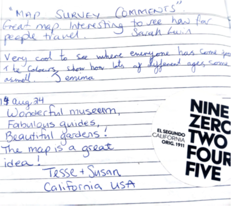
Through this survey map, we observed that in the past six months, the majority of visitors who pinned the map were aged 36-60 years, followed by visitors aged 61 years and above. The fewest visitors were aged 3-16 years. We also noted that most visitors from the United States were above 61 years followed by ages 36 to 60 years. Majority of the Asian, Scandinavian and African countries were aged 36 to 60 years. The majority of Kenyan visitors aged 3-16 years came through school groups.
The museum records this data monthly and shares it with staff and visitors. This initiative has helped track visitor trends over six months, offering valuable insights for future planning. Staff will analyse these statistics for sometime to develop strategies aimed at attracting a broader age range to the museum.
By making visitor demographics more transparent and engaging, the Pin the Map initiative enhances the museum experience while providing critical data for long-term growth. The museum will therefore continue improving in capturing the statistics to ensure accuracy and ensure the data in the map effectively supplements other data collection methods used in the museum.